BRANDING | brand COMPLIANCE | ADVERTISING
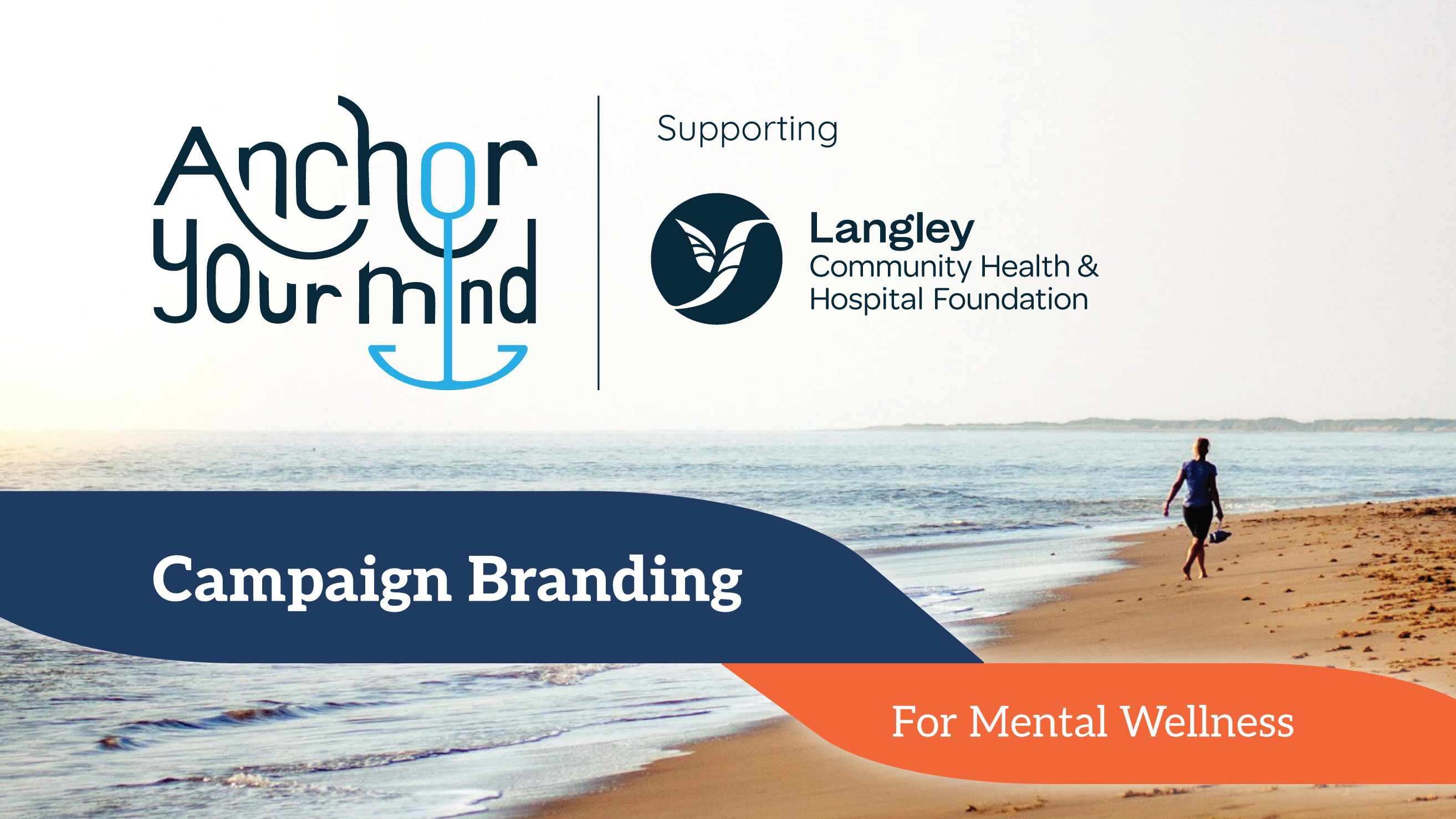
The Anchor Your Mind campaign, supporting Langley Community Health & Hospital Foundation (LCHHF), engages with the community, educates around mental wellness and its factors, and fundraises for youth mental health initiatives.
I had the opportunity to collaborate with the LCHHF team, developing a visual brand identity from brainstorming to execution—creating a look that aligned with their brand and reflected their vision. We aimed to create a campaign that felt inviting, trustworthy, and fostered a sense of belonging.
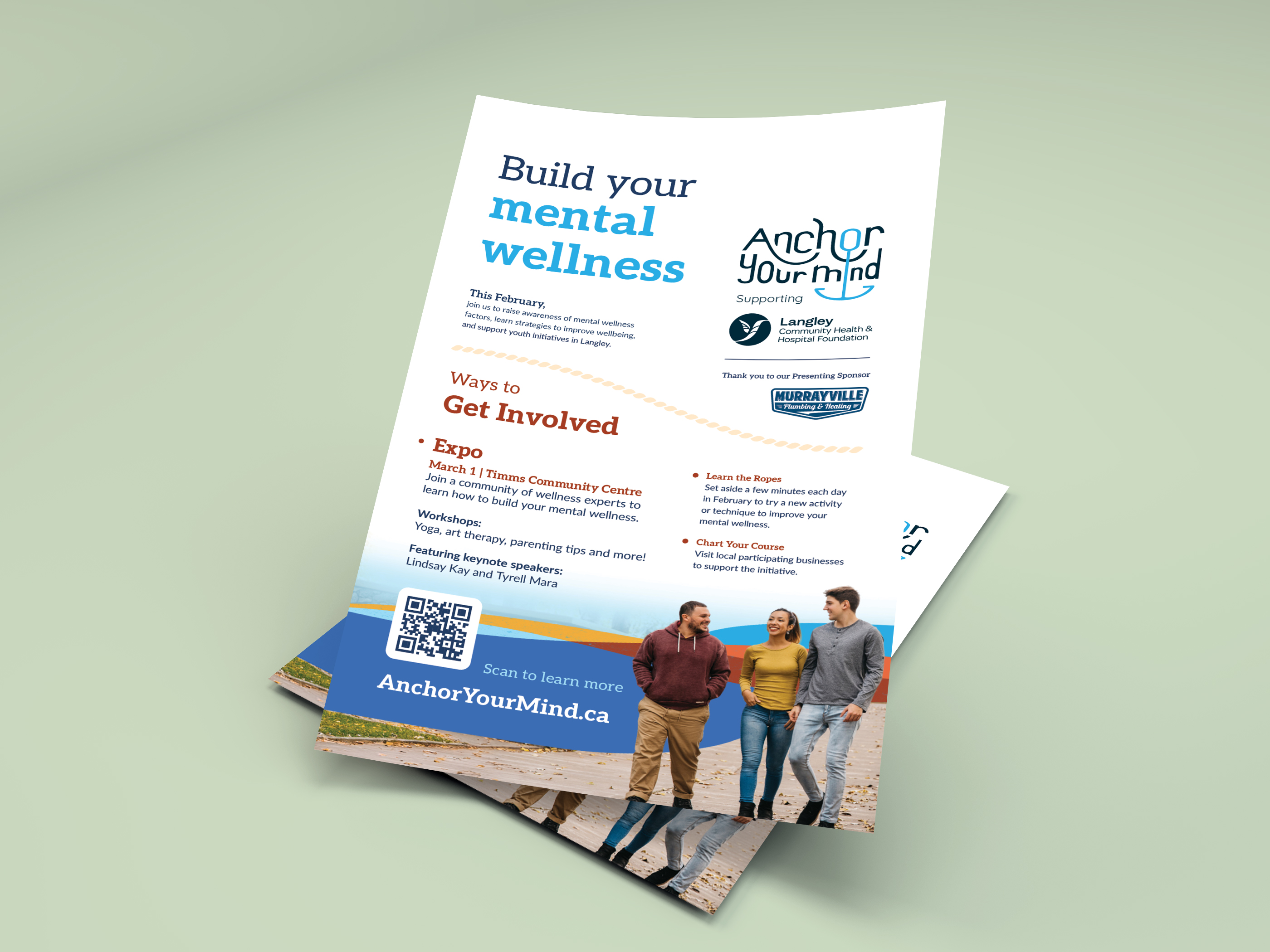
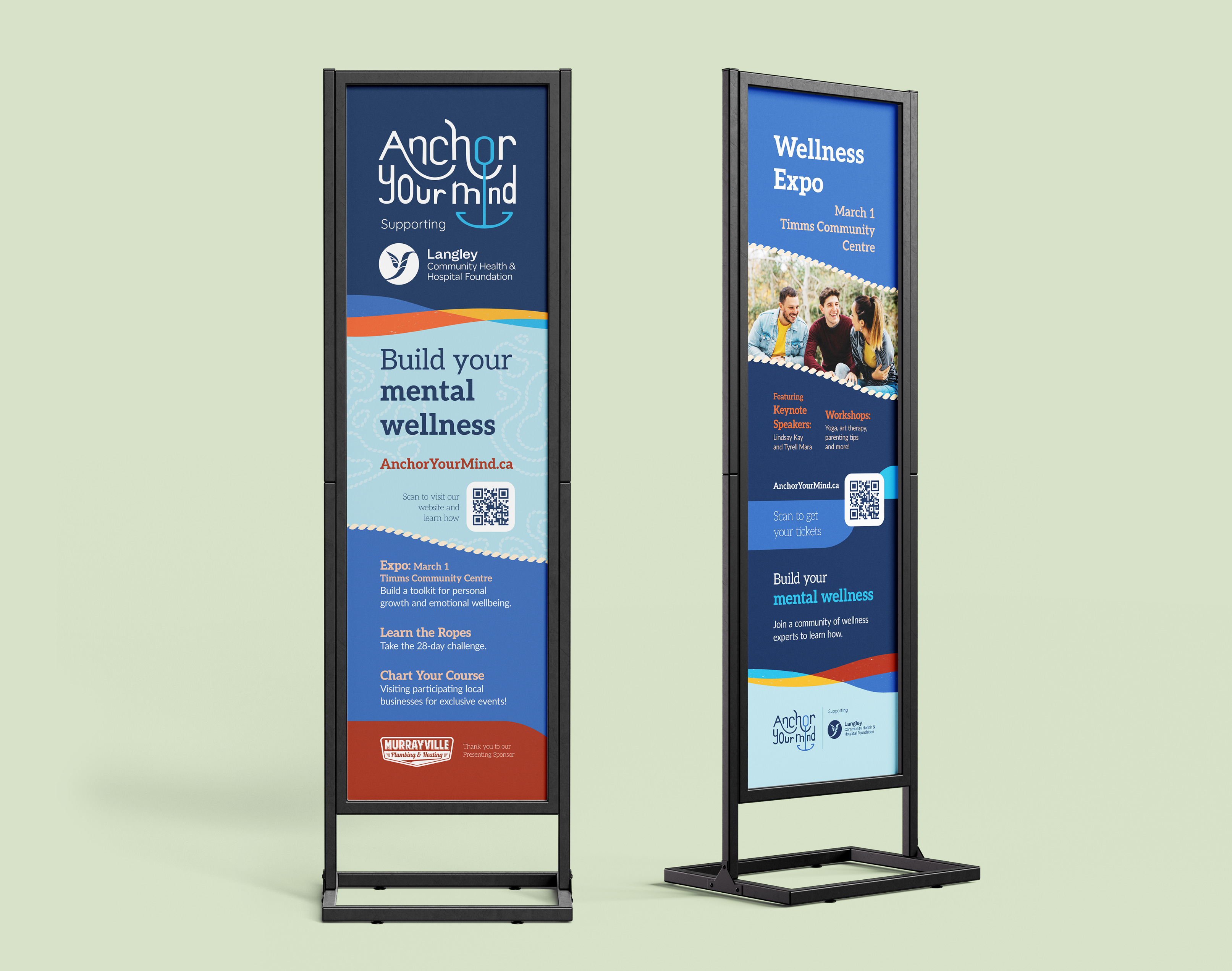
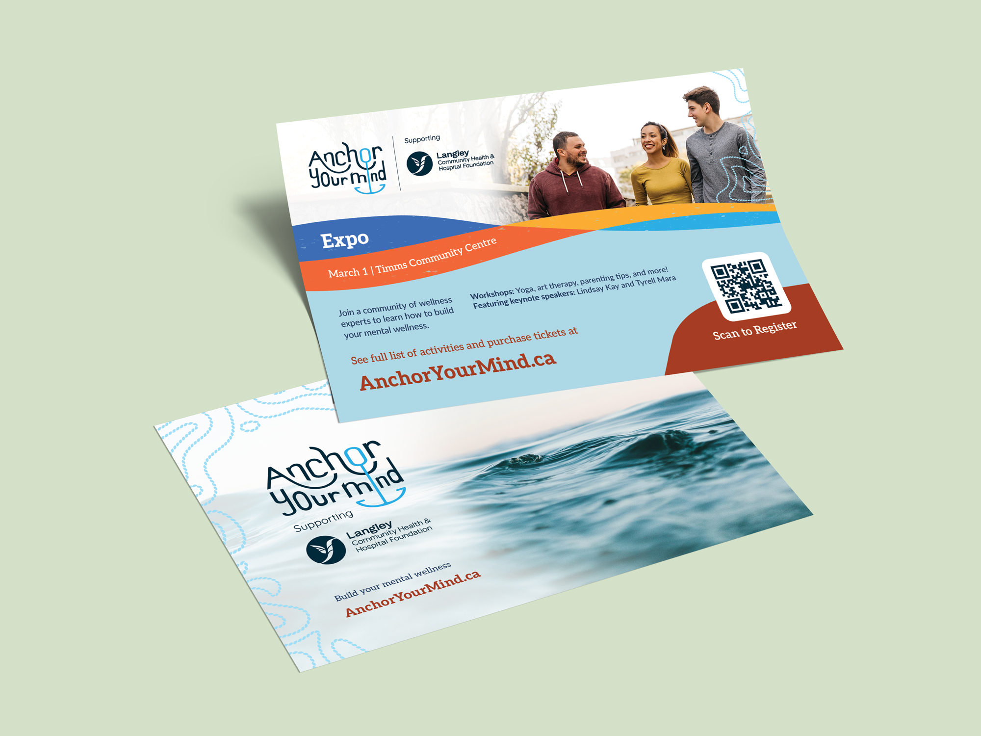
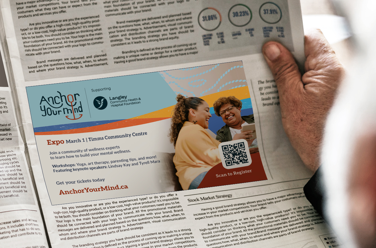
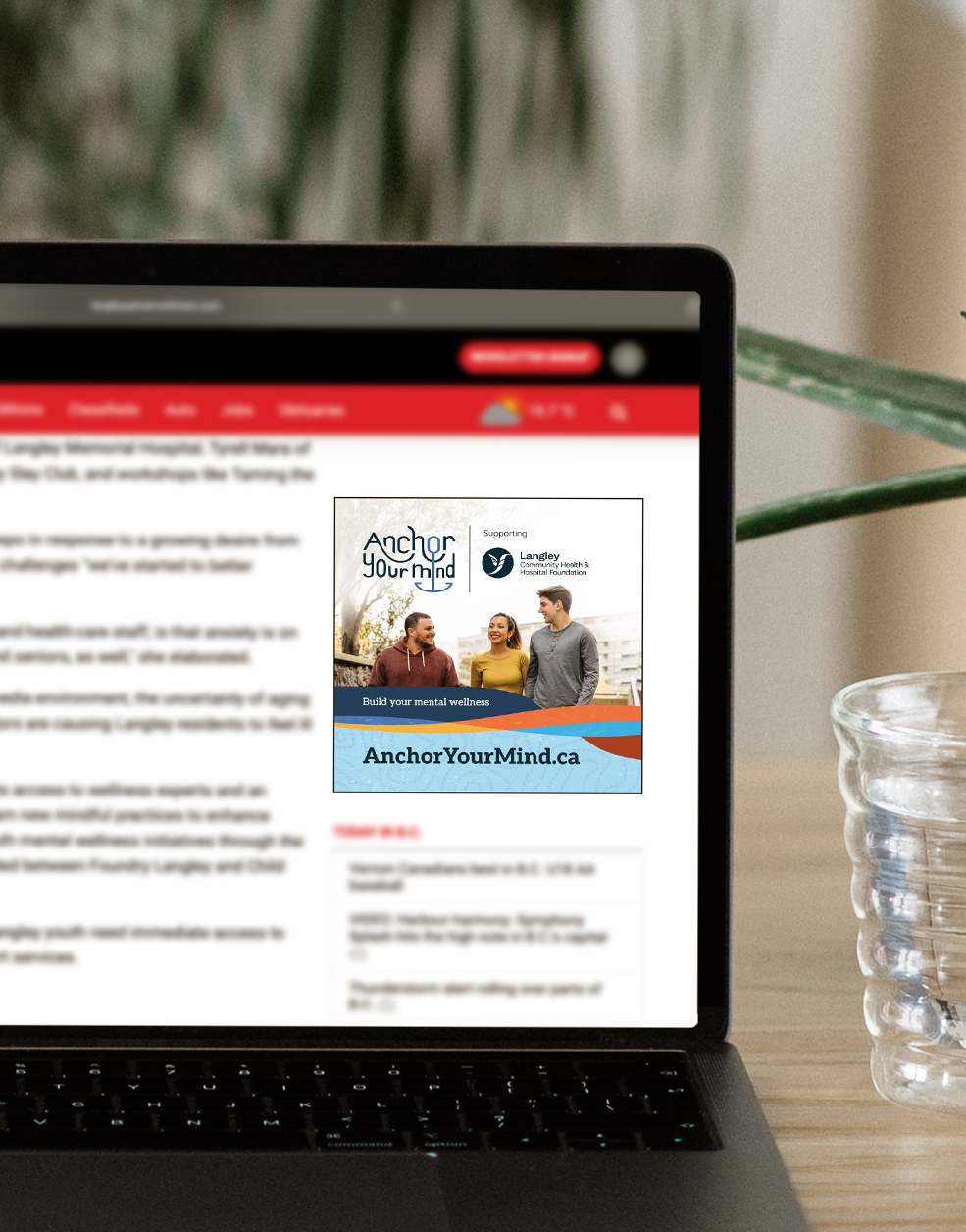
In this project, I provided LCHHF a Brand Guide, elements for their internal use, and designed promotional pieces for print and digital platforms. These included a poster and bookmark, ads and a flyer through their media partner, and onsite signage—which motivated me to learn more about large-scale printing with their local print partner.
I used Adobe Illustrator, InDesign, and Photoshop throughout the scope of the project, while the billboard design was later created as a conceptual piece for portfolio purposes.
While we initially explored different concepts, a nautical theme was chosen to represent the unpredictable seas of mental health. Guiding my visual direction, I additionally drew inspiration from brightly-coloured seaside towns as well as the resilience found in sailing rugged coastlines, ultimately focusing on communicating the message that despite life’s highs and lows, we can find our own anchor within the waves.
In reflecting this message, I was also determined in my first attempt for a stylized typographic logo, keeping it clear, scalable, and meaningful. I sketched multiple concepts, tested them on Adobe Illustrator, and finalized a version with a wave-like wordmark, featuring an embedded anchor symbol utilizing the letterforms.
Although the campaign consists of people-focused imagery to connect with the campaign mission and a diverse audience, I carried out the nautical theme throughout the brand elements.
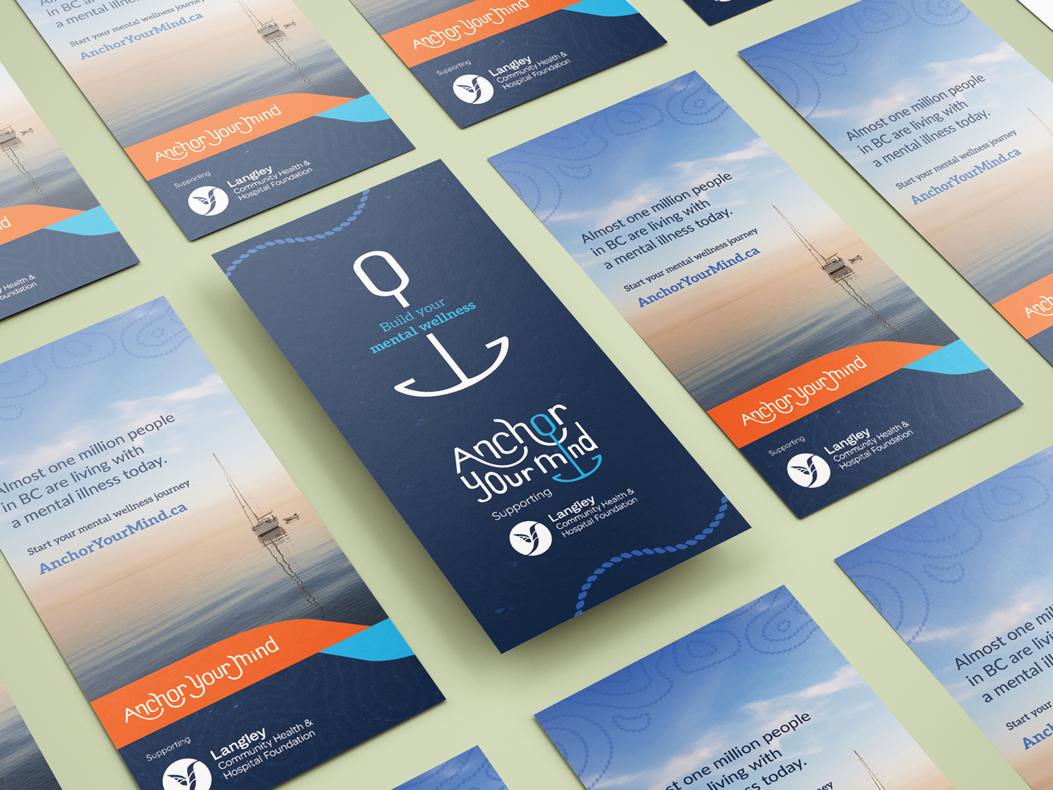
Shades and tints of blues were used in symbolizing the unpredictable seas, also conveying calmness, trust, and stability. In contrast, I incorporated oranges and yellows—drawn from the bright colours of traditional seaside towns that guided sailors home—balancing the brand with warmth and vibrancy.
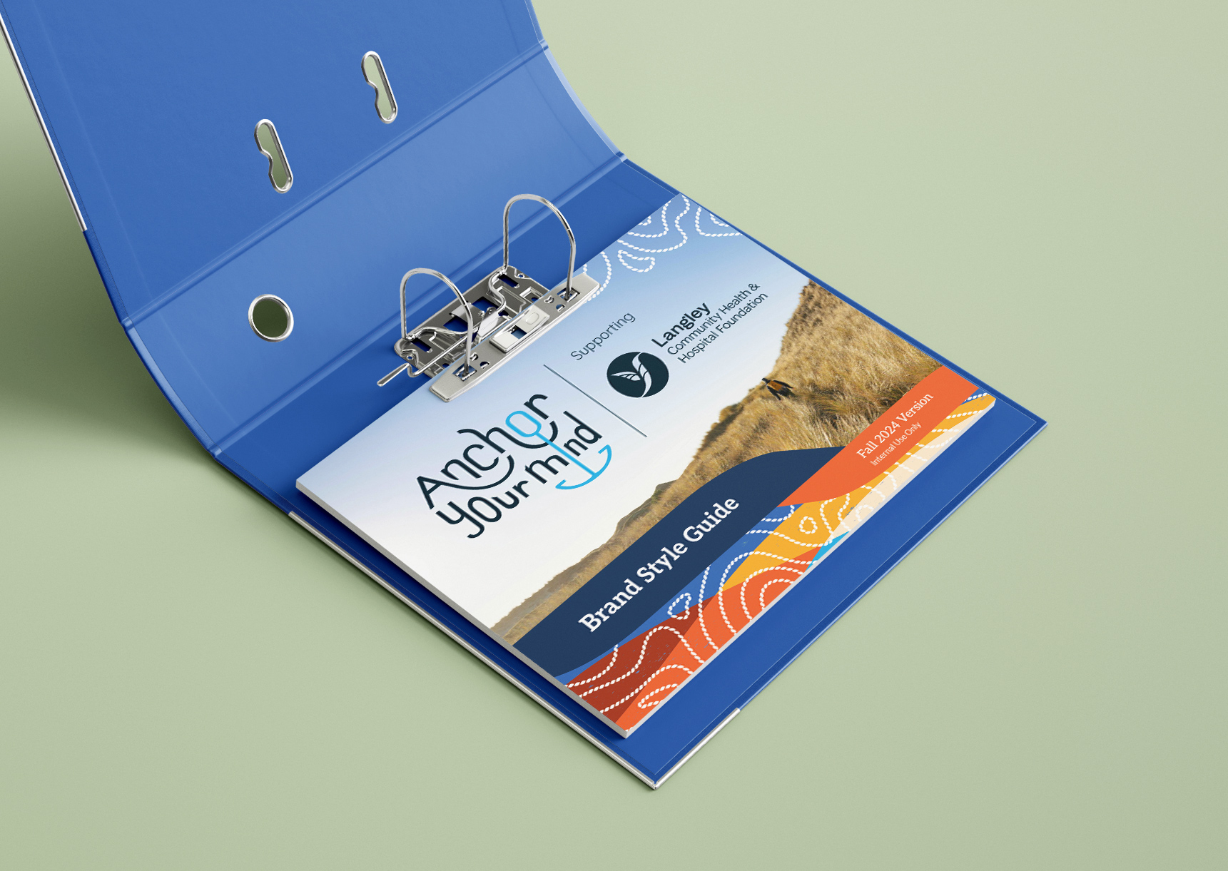
For typography, I selected a slab serif typeface for headers—a classic, sturdy style—and complemented the designs with stylized waves, ropes, and nautical map motifs to reinforce the nautical theme and symbolize the internal and external ties that keep us centred.
Anchor Your Mind was a valuable learning experience in my freelancing—shaping my workflow, navigating new design challenges, and reminding me the importance of our connections as we tread through these waters.
Learn more about the campaign here: AnchorYourMind.ca